C6 Command of visual communication techniques
Initial knowledge/skills rating *
September 2011
At first I was thinking of visual communication techniques as presentations but now I have had time to consider the heading I think there are other communication techniques that I could include here. I have used a variety of drawing techniques to communicate ideas, from very formal engineering drawings to British standards, paintings and pen and ink drawings.
As a mechanical engineering apprentice I learned to draw using both third and third angle projection. Once qualified as a draughtswoman the aim of my work was to communicate what I wanted manufactured via drawings. This would range from a single drawing carrying enough information to manufacture a single component, all the way through to an assembly drawing linking back to every sub-assembly and individual component.
I would like to revisit the British drawing standards just to refresh my memory. I would also like to take a look at shading and rendering as I think this would improve the quality of my sketching.
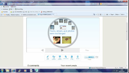
Using Prezi **
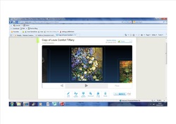
Having watched Lance using Prezi I thought I would give it a go. I am pleased with what I managed to do but why does it take me so long? I didn’t manage to link my pictures together but luckily Lance rescued me before my presentation. Unfortunately I had placed my pictures too closely together and sometimes partial images were also visible on screen with the main image. I must be aware of this next time I use Prezi.
Using Prezi again
I am using Prezi again. This time I am putting together a
Prezi for my Systems and Control project. Progress is frustrating and slow but
I am getting there. I seem to be less perturbed when something does not go well
first time and just try again and again and again. Perseverance is definitely
paying off.
I am pleased with the way my Presi is going together even if I think it takes ages. I was rather keen to try out more of the facilities available and have managed to add a YouTube clip. Yipee I am so pleased with myself.
I am pleased with the way my Presi is going together even if I think it takes ages. I was rather keen to try out more of the facilities available and have managed to add a YouTube clip. Yipee I am so pleased with myself.
Following the tutorials available on Prezi I have managed to master the art of linking my photos and words. As the size of my presentation increased I found the need to go for the more advanced tutorial that was all about avoiding causing motion sickness.I have successfully linked the frames and where desired I linked images and texts within frames.
My final piece was to choose a style and colour scheme to link my images together. I have struggled at times but I am glad to have mastered using Prezi. I feel confident that I could do it again.
Feed back
Oh dear the feed back on my project was that I had not managed more then a PowerPoint presentation. What a shame. I had actually taught myself how to use every feature on Prezi but because I did not want to draw attention to my work I did not use them. I even removed features I had used. In future if I learn to use something I must demonstrate that. Show off a little.
Mind Mapping using Bubbl.us ***
11th January 2012
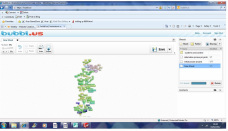
Annie introduced me to Bubbl.us and I struggled to put a
bubble down let alone do anything else but sitting down quietly at home I got
the hang of it….slowly.
Having produced a couple of mind maps using Bubbl.us I thought I might use it to make a mind map before settling down to writing an essay. The map grew and grew and as it did so did my curiosity about the other tools available. I am no longer afraid to experiment now that I have some idea what to experiment with.
Having produced a couple of mind maps using Bubbl.us I thought I might use it to make a mind map before settling down to writing an essay. The map grew and grew and as it did so did my curiosity about the other tools available. I am no longer afraid to experiment now that I have some idea what to experiment with.
As a result I discovered how to put writing on the linking lines.
Then I found out how to change the colour of the boxes and text. By the time I had finished my mind map I don’t think there was anything else to learn about Bubbl us. Can you believe that I taught myself how to make amazing mind maps!
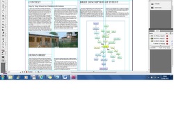
Indesign
In my first design and make project my page layouts were created by hand. I was working on A2 paper which gave me plenty of space to record the design process. By working in this way it gave me a good insight to the difficulties of working without a computer and what it would be like for pupils. I discovered how difficult it was to make changes to my work, even a spelling mistake spoiled the presentation. There was no easy way to change layouts other then to start again. There were times I added annotations and wished I could have rearranged them so that they had a little more space so that they were easy to read and that the overall appearance was spaced a little better. It was very annoying not being able to move things around.
For Our second project the idea was to record the same process electronically.
For Our second project the idea was to record the same process electronically.
Bhav gave us a taught session on layouts. Dividing the page into columns with uniform spaces between. By fitting our work into a grid system the appearance of would look more professional. This is like the grid systems used by magazines and news papers.
I had already bought A2 folders and pads of cartridge paper before I realised I would need to change my presentation methods. Typing my work condensed it and now I was able to put much more information on one page. I knew Bhav liked seeing work on this size paper and I wanted to please. I created a grid system using a yellow card overlay because the paper was too thick to see through.
Sticking my work into place was challenging. The results were horrible. Tiny miss alignments seemed to stand out and the changes in shades between the white paper looked scruffy. I felt very unhappy with this attempt at producing a digital folder. The results did not reflect the effort going in.
I have decided as it is really important to me to improve my layout skills using computers I will find another way.
I approached my eldest daughter for some guidance and started to use InDesign. I did not find this an easy program to use but the results are very good.
I approached my eldest daughter for some guidance and started to use InDesign. I did not find this an easy program to use but the results are very good.
I have decided as it is really important to me to improve my layout skills using computers. I will find another way.
Reflecting upon the experience working digitally over such a large area, 2 X A2 pages side by side, is just too much for the beginner. I found this very frustrating and wish I had settled for something a lot smaller even if it meant putting forty pounds of materials to one side. Also Indesign produces lovely results but the program really is for the professional. It is very complicated. Every photo has to be edited within a second box. it is like having to edit everything twice.
Despite this I am glad I tried.
Despite this I am glad I tried.
Time-line software
5th March 2012
Having discovered you can get free trials of software I thought I would look for something to create a timeline. The results of my search and my thoughts about using it can be found in C14 by using this time-line hyperlink
Having discovered you can get free trials of software I thought I would look for something to create a timeline. The results of my search and my thoughts about using it can be found in C14 by using this time-line hyperlink
PowerPoint Presentation
6th March 2012
PowerPoint is a name I know but not something I have ever used. I needed to create a tutorial presentation for my peers so I set about learning to use the software. It took me ages!
Creating a backdrop for green screen
17th march 2012
Today I started to cut out images of household objects from the late 1960's/early 1970's to go into a power point presentation. The PowerPoint presentation will be used to create a backdrop to a video a group of us are going to film on Friday in the university film studio. Even if the PowerPoint pictures are consistent in where objects are placed in relationship to each other there is no guarantee when they are passed through the system in the film studios they will remain in the same place on the green screen. For this reason the images need to be moveable. I am thinking if we place each image on a new layer in PhotoShop any alterations required can be made without affecting the picture as a whole.
The first thing I need to do is cut each image out. I didn't realise it would be easier to cut images out using PhotoShop if the image was on a white background. The images I have collected are generally on multicoloured backgrounds.I am going to try and cut the image on the plainest background out in PhotoShop. If that doesn't work I think I will try 2D design followed by illustrator. I will also search for images on a white background but I do not remember them being in abundance.
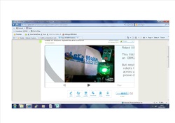
Teas made image before editing
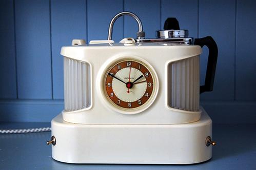
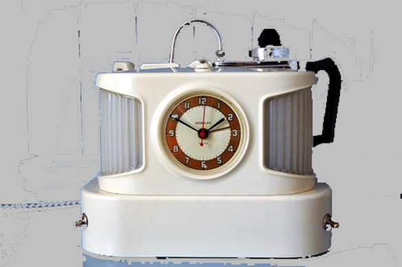
Although I have not quite finished cutting out the image I have already lost some of the detail in the top right hand corner.
It may be possible to go back and select different colours and therefore not remove this detail. I do not think it is possible to de-select part of an area that has been selected using the magic wand tool.
It may be possible to go back and select different colours and therefore not remove this detail. I do not think it is possible to de-select part of an area that has been selected using the magic wand tool.
I have struggled but I got there in the end with a little help from my peers. I have got to admit I did not find it at all easy. hopefully next time it will get easier. This image will form part of a video about the history of vacuum cleaners. Photographs and film are very effective forms of visual communication.
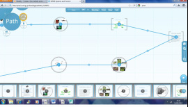
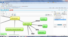
Xmind mind free mapping software
15th May 2012
As part of Learning in a Digital age, another module on this 2 year degree course, we were required to use digital tool to create a mind map. I could have used Bubble.Us but when I started this degree my aim was to learn to become proficient at using digital technology. Therefore to increase my skills I am learning to use as many programs as possible. I experimented with the different tools and created this. I was interested in the background fill as this is not a feature of Bubbl.us but I didn't really think they loaned itself to a professional look. Nice to know free programs exist. They may have a place in my life one day.
As part of Learning in a Digital age, another module on this 2 year degree course, we were required to use digital tool to create a mind map. I could have used Bubble.Us but when I started this degree my aim was to learn to become proficient at using digital technology. Therefore to increase my skills I am learning to use as many programs as possible. I experimented with the different tools and created this. I was interested in the background fill as this is not a feature of Bubbl.us but I didn't really think they loaned itself to a professional look. Nice to know free programs exist. They may have a place in my life one day.
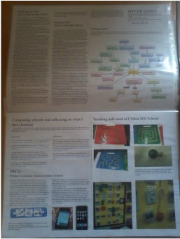
Mood Boards
A group of my Peers sat down to discuss what we thought units of our audit meant along with ideas we had pursued. I realised then I had not included some of my favourite methods of visual communication. I absolutely love mood boards now but this was not the opinion I held of them before I made my first one. When I had seen my daughter make one for her GCSE resistant materials a few years ago I thought it was a horrible mess. I didn't believe it was of any value. I could not have been more wrong.
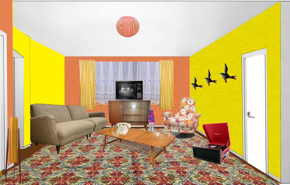
Below are images of my very first mood boards. I was looking for inspiration for a design and make project. I buzzed with ideas and loved collecting images of things that appealed to me. It may have been a colour, a shape, a pattern. It didn't matter because with every thought provoking image came a new trail of ideas to explore.
When I came to assemble my mood board I realised just how much research I had done. I became frustrated when I tried to arrange the pictures. My daughter pointed out I was trying to make a pretty presentation and that is just not how mood boards work. I found myself more drawn to some images rather then others and could not bare to put them all together. By selecting the images that apealled to me the most I began to see a theme appearing. Eventually I made two mood boards one from the ideas I was rejecting and one from the ideas I wanted to carry forwards. My mood boards conveyed the development in my thinking for all to see.
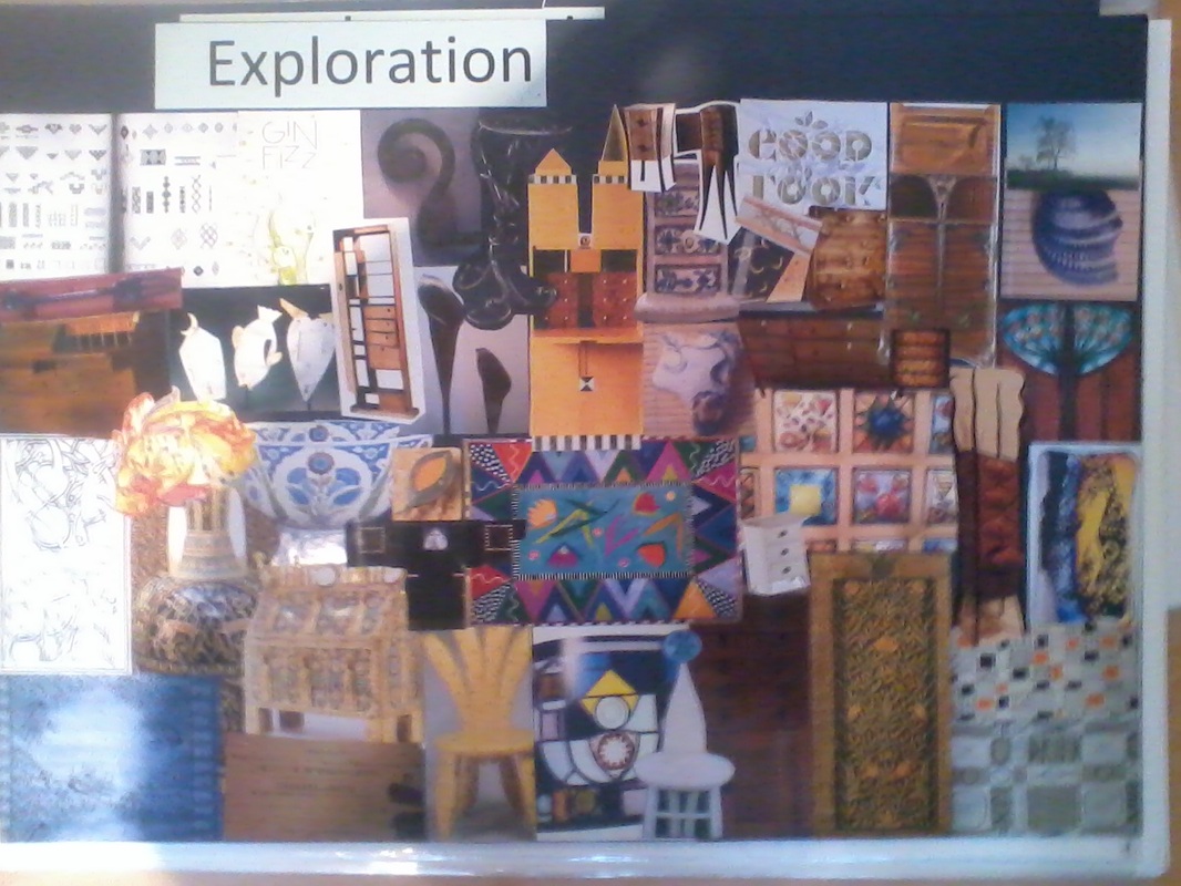
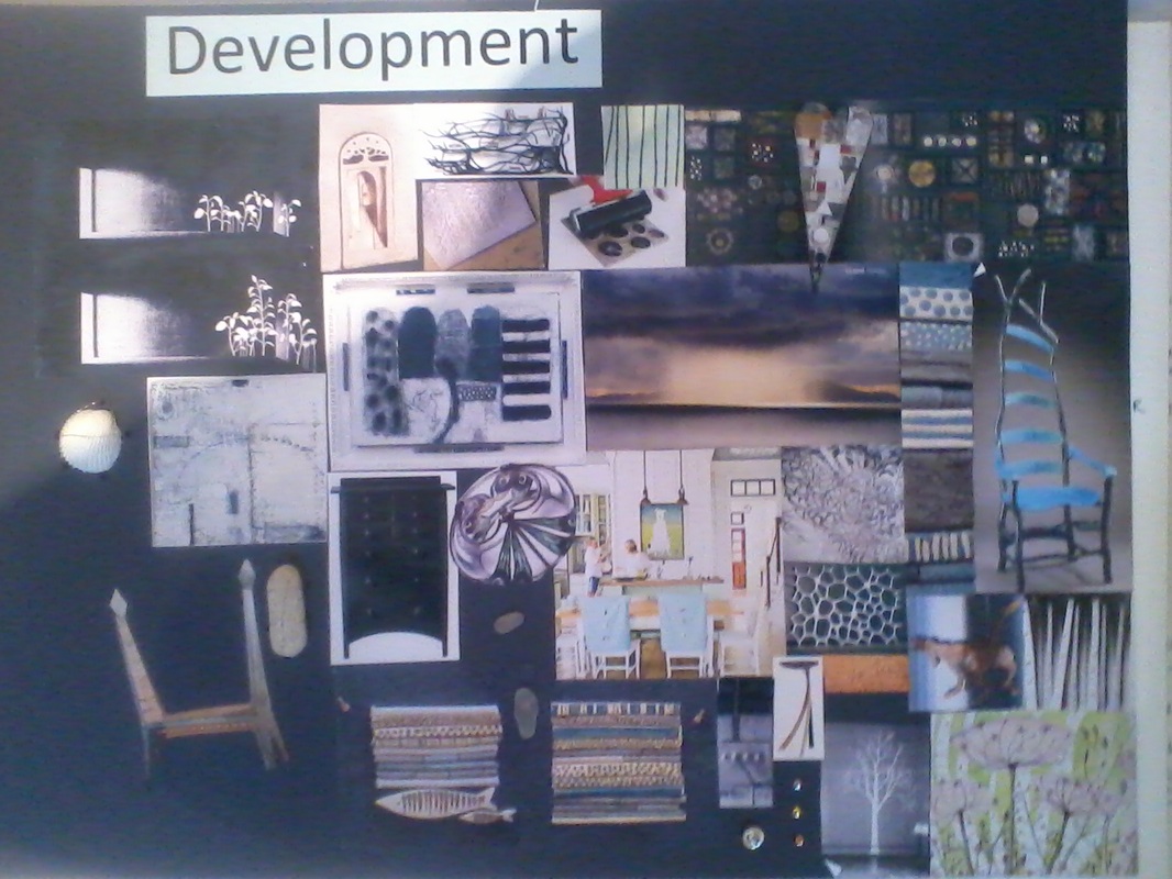
By physically assembling a mood board it is easy to see if an idea, colour or shape looks out of place. I found by putting my ideas down on paper it was easier to select and reject ideas. I am very good at visualising ideas and as I can see from my mood boards I have lots of them. What I am less good at is selecting one idea and sticking to it because new ideas are always popping into my head. By having a mood board that I could go back I found it easier to stick to ideas and if I did have new ideas it was easier to see if they fitted.
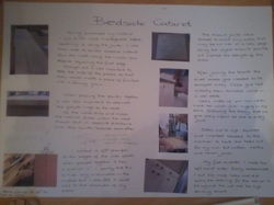
I felt my finished bedside cabinet carried the memories of holidays by the sea very well. I made pewter castings from shells I had collected and used them for hooks and a handle. I made glass fish to set in the top. These links to the sea are obvious. But then I used chamfered edges where I had joined my planks of wood making them reminiscent of beach huts. I set little pieces of veneer into the mortice and tenon joins, spacing them unevenly reminiscent of the wooden relics visible on some beaches. I allowed the soft wood grain to show against the hard grey of the pewter like rocks with a splash of sea glass in the fish.
I felt my finished bedside cabinet carried the memories of holidays by the sea very well. I made pewter castings from shells I had collected and used them for hooks and a handle. I made glass fish to set in the top. These links to the sea are obvious. But then I used chamfered edges where I had joined my planks of wood making them reminiscent of beach huts. I set little pieces of veneer into the mortice and tenon joins, spacing them unevenly reminiscent of the wooden relics visible on some beaches. I allowed the soft wood grain to show against the hard grey of the pewter like rocks with a splash of sea glass in the fish.
Although my mood boards have become less extravagant they have become something I produce with ease at at every opportunity. Even a few ideas together work well to help develop an idea.
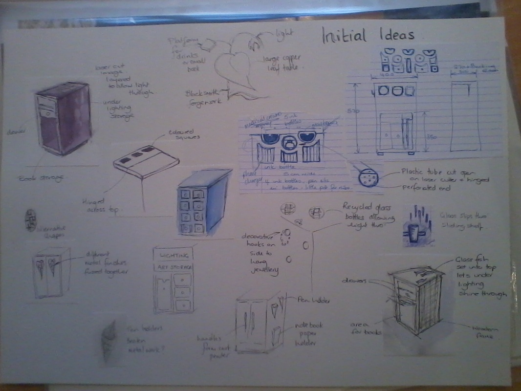
Sketches
In my first sketches I experimented with different media. Rendering with pen, pencil and water colour was fairly successful. Charcoal was a bit of a mistake as it was messy, even with a fixative it still smudges. Sketches are quick to produce and serve well well trying to explain ideas to someone else. Notation is really important to clarify, convey and record ideas and thoughts.
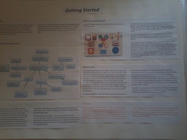
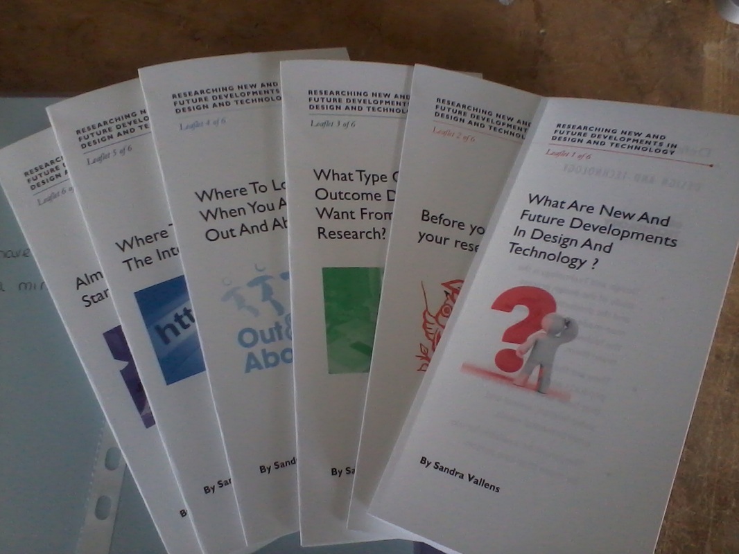
Information leaflets
I amazed my self with these! I have never even tried to make anything like them before and I thought the results looked quite professional. I kept the text short and too the point including only key facts and bullet points. I supported the ideas within the text with images. Not bad for a first attempt.
August 2012
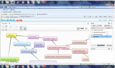
Mind maps
Using Inspiration my new mind mapping software and my IT tuition I am producing better mind maps that create less visual noise. They are a great way to order my thoughts and ideas. Using shapes, images and colour can help sort the hierarchy of ideas.
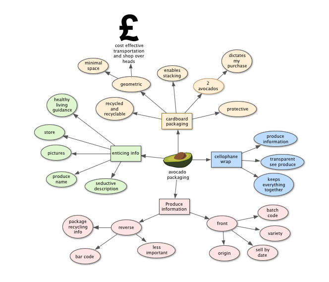
Mind maps ordered in this way are much clearer and easier to understand then my earlier attempts using Bubbl.us. Working on the principle that different levels of the hierarchy are distinguished by appearance, be that pictures or shapes, it is easy to see at a glance the importance each idea.
Main topic: This should stand out from the crowd. I have used a picture of an avocado which is easily associated with the heading "avocado packaging". If I had a set of mind maps in front of me I would be able to pick the picture of an avocado much faster then I would be able to pick out the word avocado. So without reading or decoding I would be able to pick out the appropriate mind map.
Sub topics: Radiating out from the main topic are the main ideas about the packaging that I want to explore. All of these text boxes are linked by the common shape: a rectangle.
Exploration: Branching out from each sub topic are the ideas exploring that sub topic. Ideas at this level are linked by shape; this time an oval.
Colour: If each sub topic has its own colour and every idea from the sub topic shares the same colour it is easy to identify linked ideas at a glance.
This mind mapping tool allows me to go further putting hyperlinks to other pieces of work and the internet. I can add relevant notes. I can chose what is visible and what gets hidden.
The main thing is, as with all successful visual communication, ideas are conveyed clearly and quickly.
Skills rating *****
Although this is an area I think I will be forever improving I do feel I have gone a long way to being competent in my presentation skill. I started with zero presentation skills as far as computer generated presentations go. I am amazed how far I have progressed.
